
If you read my recent post about how I transformed our house into a coastal retreat, you already know how much love (and how many paint swatches) went into this renovation. So many of you asked about specific shades, so I thought it was time for a blog post dedicated entirely to the wall colors that helped turn this house into such a calm environment.
Now, these colors happen to live in our home near the water, but don’t let that fool you into thinking they only work in a coastal-style space. These are genuinely some of my top paint colors for creating a relaxing home no matter your design style. Whether you’re in a farmhouse, a city loft, a craftsman, or anywhere in between. A soft blue or a warm neutral doesn’t know what zip code it’s in; it just does its job of making a room feel calm.
Choosing the right paint color is one of the easiest and most affordable ways to change how a room feels. It’s honestly one of the first things I think about with any renovation, because a wall color sets the tone for absolutely everything else in the space, from the furniture to the light fixtures to how relaxed you feel the moment you walk in. Below, I’m sharing the exact paint colors we used throughout our home, why I chose them, and a few thoughts on the psychological effects of color that I kept in mind the entire time.
Why Paint Color Plays Such a Big Role in How a Room Feels
I’m not a color scientist, but I’ve read enough about color psychology over the years to know it’s not just decorating fluff. Interior designers have long relied on the psychological effects of color to help a room feel a certain way, and there’s real research behind it. Certain hues can genuinely influence your nervous system, and some studies even suggest that softer, cooler tones can have a small calming effect on heart rate and blood pressure. That’s a pretty big role for something as simple as a can of paint to play.
Of course, personal preferences and personal experiences matter just as much as any color chart. What feels like a soothing color to me might not be your idea of a calming color at all, and that’s okay. Your design style is exactly that, it’s yours. But if you’re aiming for a peaceful sanctuary in your own home, there are some tried-and-true categories of colors worth considering: soft blues, warm neutrals, gentle grays, and soft greens all tend to show up again and again as popular choices among people looking to create a serene environment.
Soft Blues for a Calming Space
Since our home sits right along the water, soft blues were always going to play a starring role, but honestly, this is a category of color I’d recommend to just about anyone, regardless of where you live. Light blue and other watery hues are some of the best hues for evoking the natural world. Think sky, sea, and the great outdoors, which makes them an ideal choice for a relaxing living room in any home, coastal or not.
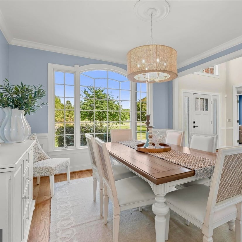
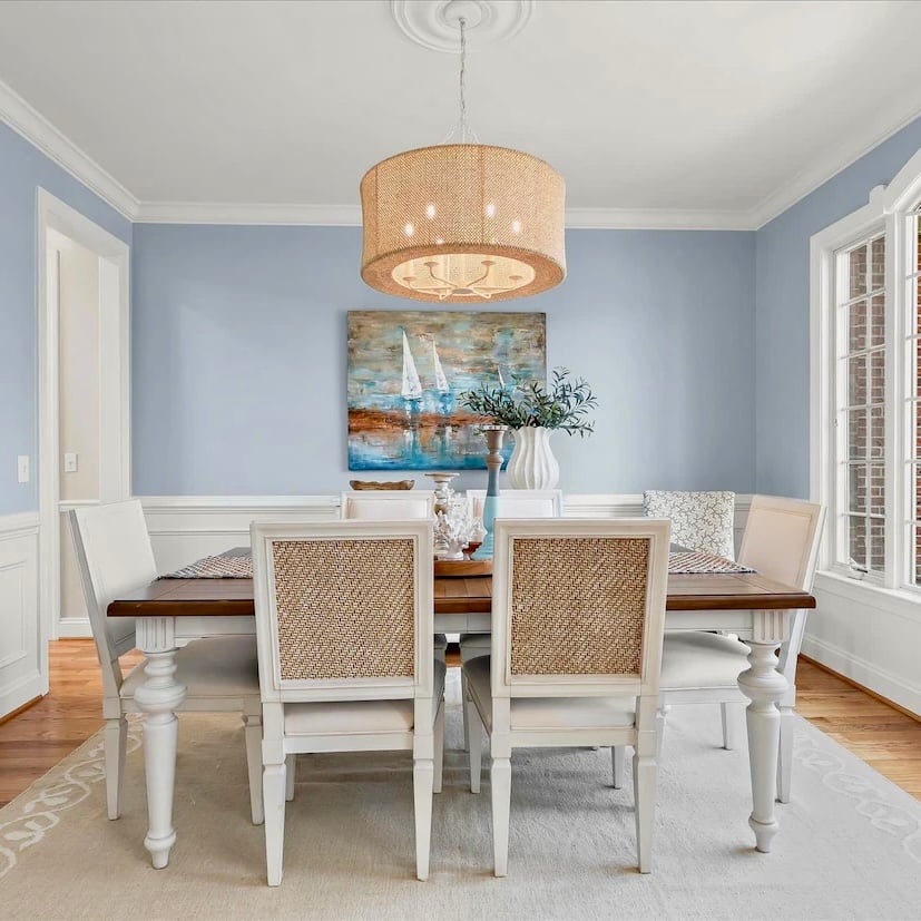
In our dining room, I leaned on Sherwin Williams Niebla Azul, a soft, hazy blue with just enough gray mixed in to keep it from feeling too bright or too “beachy kitsch.” I paired it with white picture frame molding painted in Sherwin Williams Snowbound, and the crisp white against that beautiful blue is one of my favorite combinations in the whole house. Add in some of the natural accents in the chandelier and dining chairs, and this room ends up feeling really special. It’s proof that a calming backdrop can still have plenty of personality.
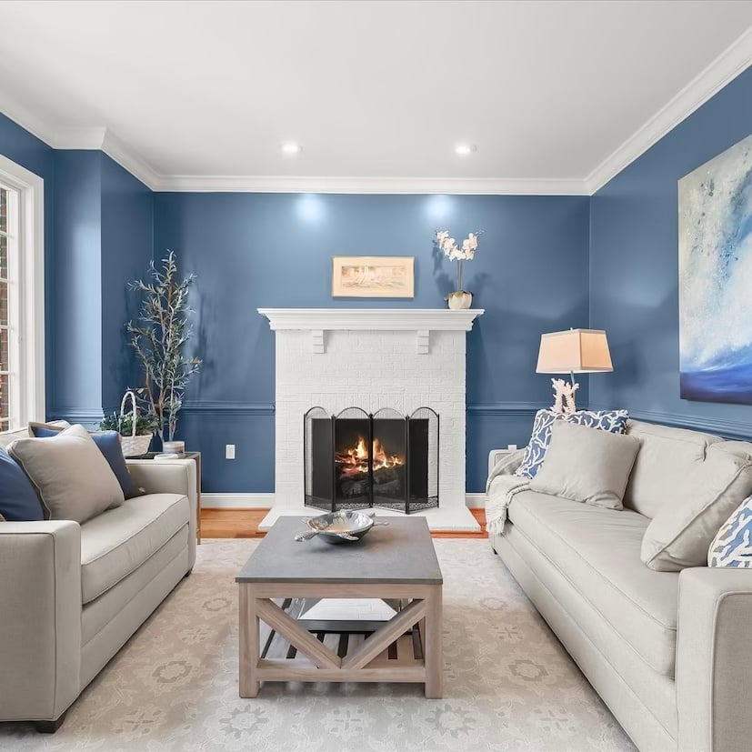
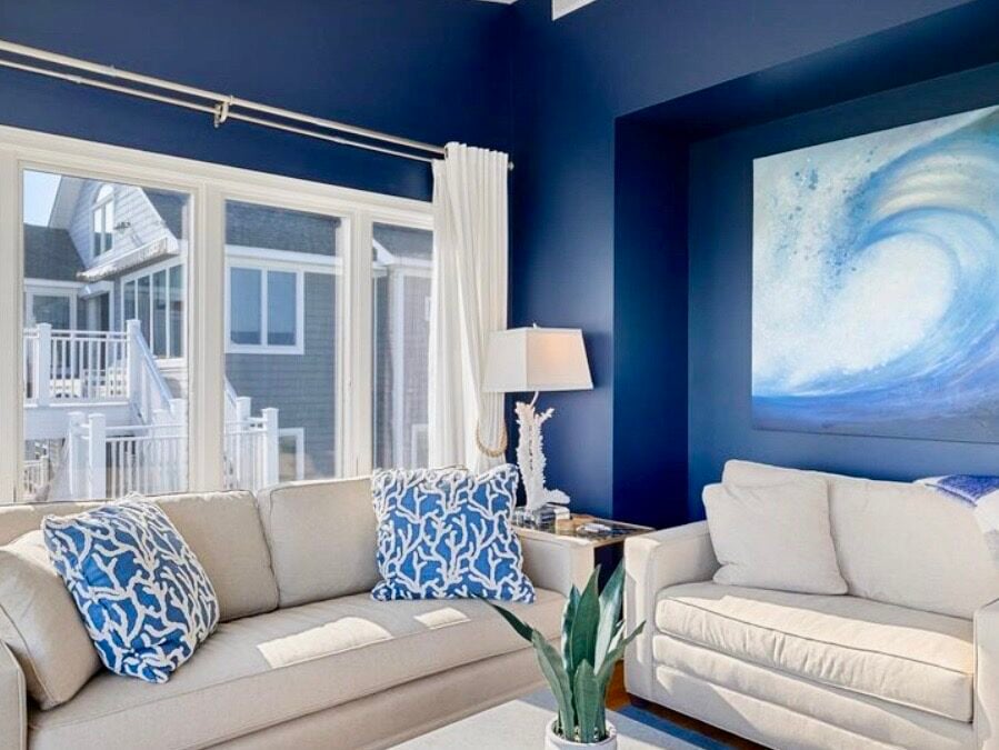
For a deeper, cozier version of blue, I used Benjamin Moore Van Deusen Blue in our little study. It’s the room I mentioned in my last post that Doug calls the “Coastal Cozy Blue Room.” This is a much moodier, warmer navy-adjacent blue, and while it’s technically a deeper color rather than one of the lighter shades, I still consider it one of the best calming paint colors in the whole house. There’s something about a warm, saturated blue in a smaller room that makes it feel like a hug, perfect for curling up with a good book. I drenched the whole room in it, including the trim and chair rail, so the color wraps around you rather than competing with itself.
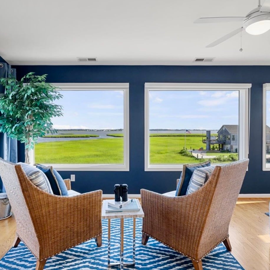
This isn’t the first time I’ve used a dark blue for a room. In our previous home in Bethany Beach, Delaware, I used a deeper more saturated blue. Sherwin Williams Naval, is a decorator favorite and it worked really well in this room. This room has a lot of light from the large picture windows and there really isn’t a lot of wall space. That allowed me to use a deep color without worry that room felt too heavy. Of course the water and green from the tidal grasses made for a pretty contrast too!
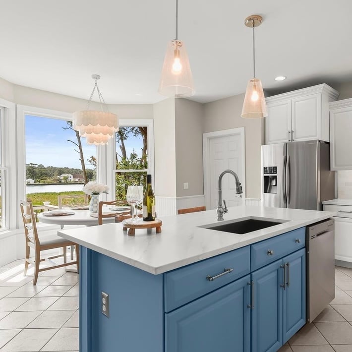
And of course, in the kitchen, our island got a beautiful pop of blue in Benjamin Moore Denim Wash, which ties the warmer tones of some of our wood furniture back to the soft blues used throughout the rest of the house. It’s proof that you don’t need to paint an entire room in blue to get the calming backdrop effect. Sometimes an accent wall, a piece of furniture, or a single island is all it takes.
Warm Neutrals and Gentle Grays for a Quiet Backdrop
Not every room needs to be a color. Some of the most versatile shades in our home are actually soft, warm neutrals which give the eye a place to rest between all those blues and greens. Neutral tones are a great option when you want a soft backdrop that still feels warm and inviting rather than cold or sterile.
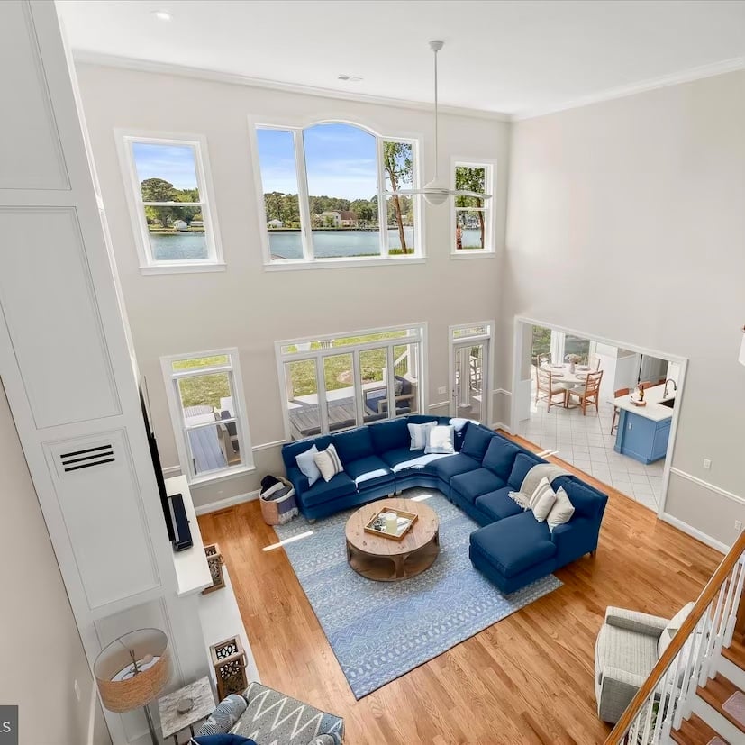
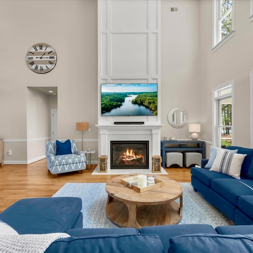
Benjamin Moore Edgecomb Gray has become one of my top choice neutrals for just about any room, and it’s the color I chose for our family room. Our sectional sofa is navy, and since I love a good blue-and-tan combination, this shade felt like the perfect backdrop. It’s technically a warm greige, so it’s equal parts warm beige and gentle gray, with subtle warmth and just a whisper of true beige underneath.
And despite the name, I’d argue it actually leans more beige than gray in most light conditions. It has enough body to the beige that you notice it, but it’s neutral enough to quietly fade into the background rather than compete with the navy sofa or any other furnishings in the room. It’s not too cool and not too warm, which is exactly what makes it such a wonderful backdrop for almost any room in the house — it doesn’t shift too dramatically with different light conditions, and it plays nicely with both the wood tones and the cooler blues we used elsewhere in the house.
A Few More Neutral Paint Color Options
If you love the idea of Edgecomb Gray but want something a touch lighter, Sherwin Williams City Loft is another great pick. It has that same easy, neutral versatility, just a shade brighter — a nice option if your room doesn’t get quite as much natural light and you want the wall color to help it feel bigger and airier.
On the kitchen walls, I used Sherwin Williams Accessible Beige. It’s just a smidge warmer than Edgecomb Gray and that’s what I wanted with the contrast of the white kitchen cabinets.
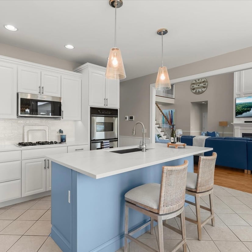
For trim, ceilings, and a few walls that needed something crisp and clean, I turned to Sherwin Williams Snowbound, one of those creamy whites that reads as a true neutral rather than stark white. It’s a wonderful choice if you have a lot of natural light, since it won’t feel flat or clinical the way some brighter whites can.softer.
I liked Snowbound so much on the trim that I also used it on our kitchen cabinets, and honestly, this is the white I keep going back to project after project. It’s not stark, it’s not yellow — it’s just a soft, true white that works in almost any light condition and against almost any other color in the house. If you’re on the fence about which white to choose, this is the one I’d point you toward first.
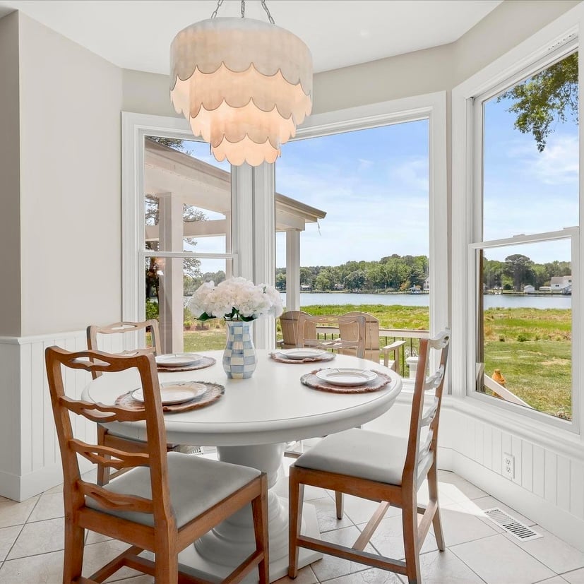
While I was in “paint the furniture” mode, I also had my painter give our kitchen table a fresh coat of Sherwin Williams Pearly, another soft, creamy white. It turned out to be the perfect match for the capiz shell chandelier that hangs above the table — the soft glow of the shell against that gentle white really makes the whole breakfast nook feel calm and pulled together.
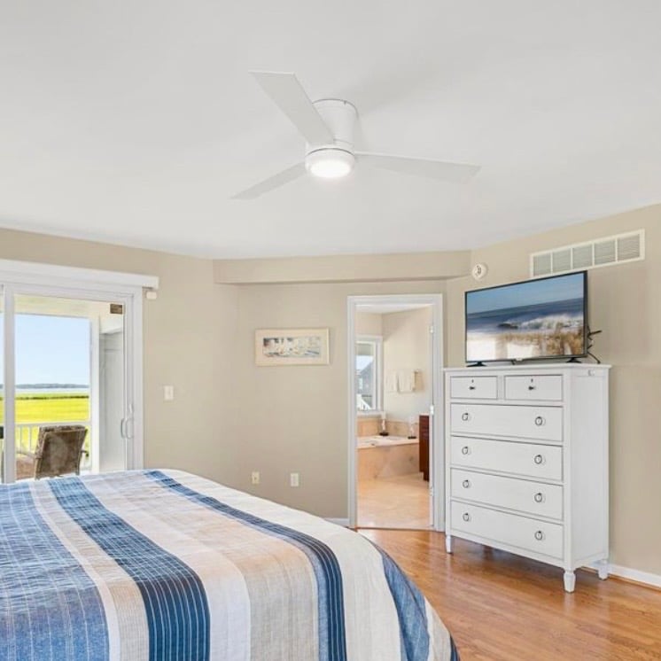
One other neutral worth mentioning is Sherwin Williams Woolskein. I used this in the master bedroom at our previous home in Bethany Beach and always felt it was a calming shade of beige. It was there…but it wasn’t , if that makes sense?
Other Calming Paint Favorites
Beyond the colors we actually used in this house, there are a few other shades I find myself recommending again and again when friends ask about the best calming paint colors for their own homes.
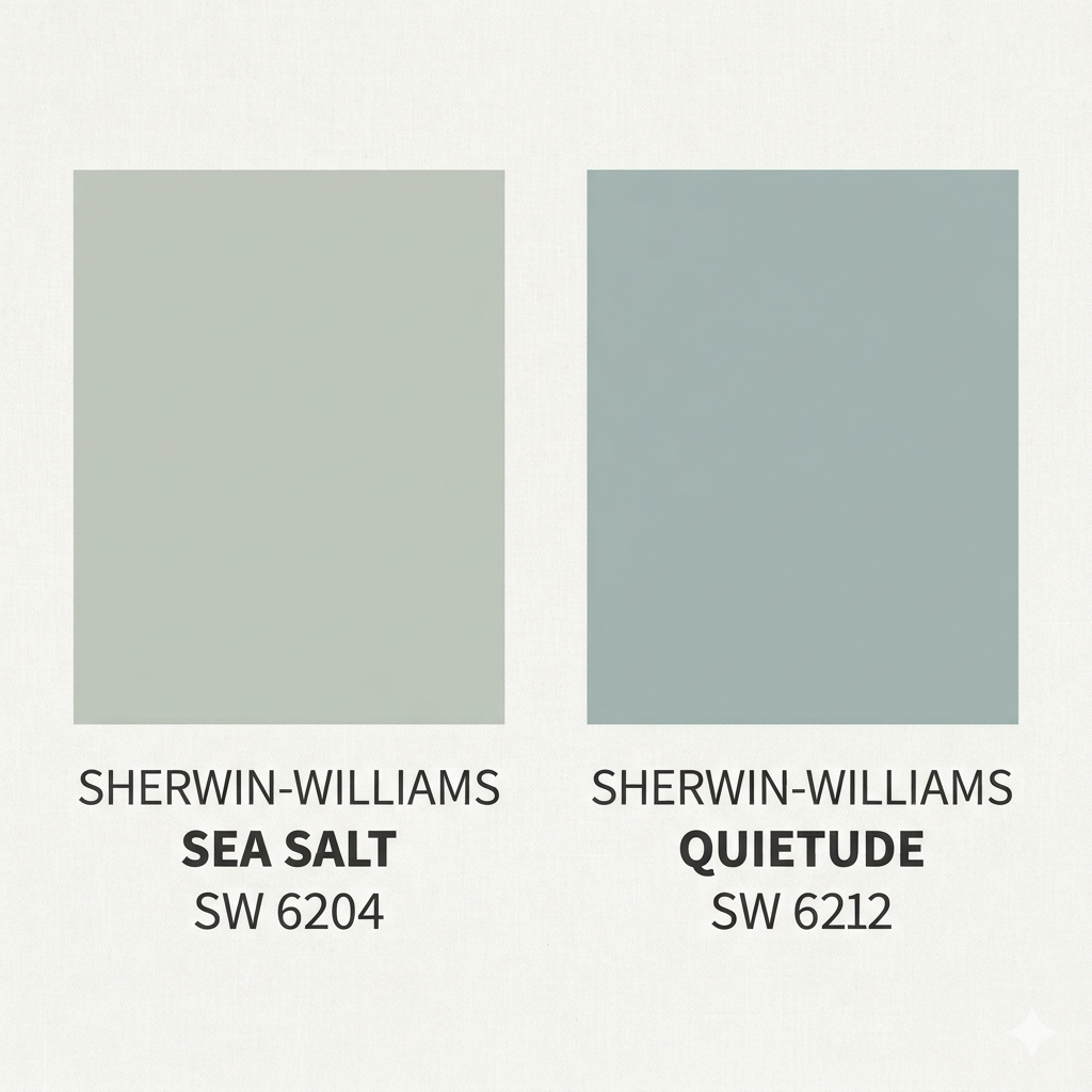
Sherwin Williams Quietude and Sherwin Williams Sea Salt are two of my favorite soft greens, and they both have that same watery, coastal feel as the blues I love so much. They read as muted, almost gray-green, which makes them incredibly easy to live with, more of a soft backdrop than a bold statement.
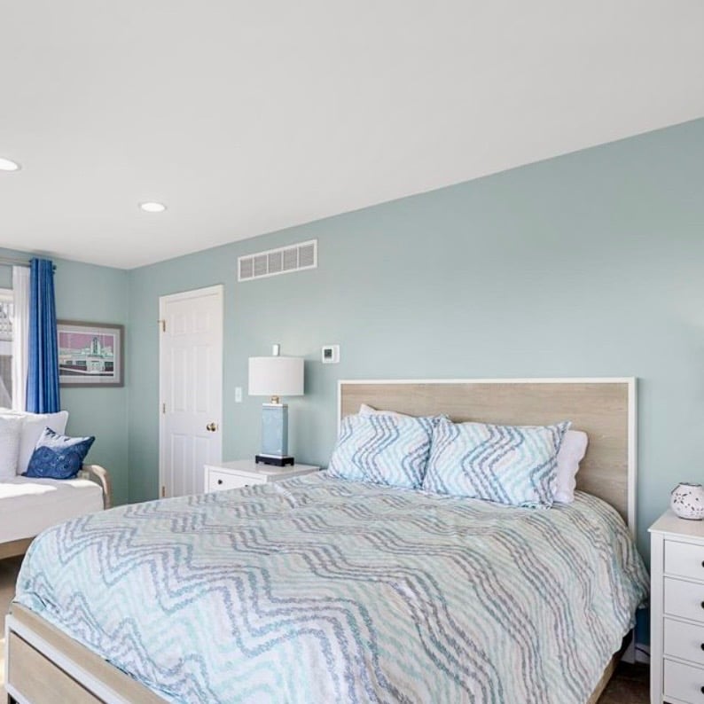
I used Quietude in our previous home in Delaware. If a serenity green is on your mood board but you want something even quieter and more subdued, either of these is a wonderful option, and they layer beautifully with natural materials like woven baskets, linen, and light wood tones.
I also used Quietude and Naval in a home makeover I did for the TODAY show. What a thrill that was! If you’d like to see how I used these colors in that home, you can read about and see more images by clicking HERE. Think about it…if these colors were good enough to use on a national television makeover segment, then I’d say they’re a pretty good bet for your home too!
A Front Door Paint Color That Says Welcome!
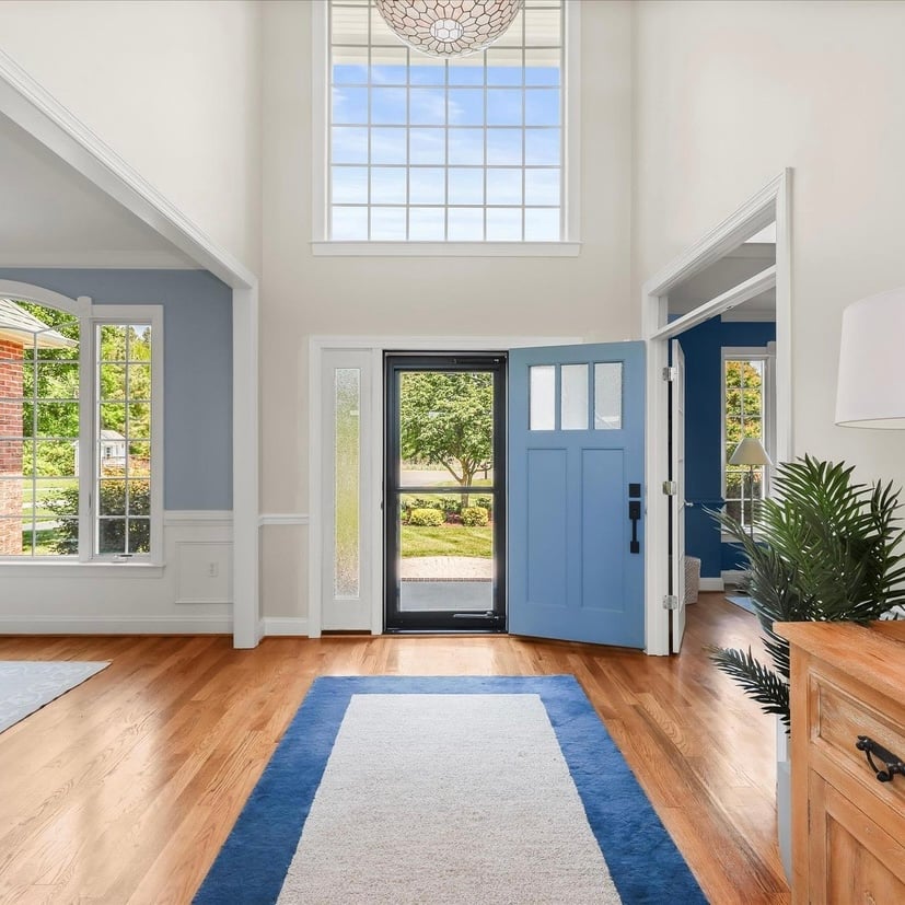
When we installed a new front door, I wanted a color that felt welcoming the moment you pulled into the driveway, so I chose Sherwin Williams Poolhouse. It’s a cool blue with a slate undertone, and it turned out to be the perfect entrance to our coastal retreat. It feels calming before you even step inside.
A Few Tips for Choosing the Right Colors for Your Own Home
If you’re standing in the paint aisle feeling overwhelmed, here are a few things I’ve learned along the way:
- Consider your room’s light conditions before anything else. The same chip can look completely different in a north-facing room versus a sunroom.
- Think about room size. Darker colors can make an entire room feel cozy and intimate, while lighter shades tend to open a space up. Neither is right or wrong! It depends on the mood you’re after.
- Test a sample before you commit. Check out Samplize! These are the smartest invention ever! Large in size, these are peel and stick, repositionable paint swatches with the equivalent of 2 coats of a satin finish. This is the truest color match I’ve ever had with paint. I won’t ever NOT use them for a paint project. Click HERE to learn more!
- A satin finish is a great option for walls that get a lot of touching or cleaning, for example your kitchen, mudroom, or hallway. Always use flat on your ceiling and consider a more matte finish on walls that gets tons of light. A more reflective paint finish will highlight every flaw in the wall surface.
- Bring in natural materials. Woven baskets, wood furniture, linen, and other natural elements help ground any color scheme and reinforce that connection to the natural world.
- Remember your mental health matters here too. Our homes should feel like a soothing, calming environment, not just an Instagram backdrop. Choose colors that genuinely bring you a sense of tranquility and support restful sleep, especially in bedrooms.
At the end of the day, there’s no single “perfect” palette, just the one that reflects your personal style and makes your home feel like your own peaceful sanctuary, whatever your design style happens to be. If you’re working with a professional painter or getting a free estimate from a few different painters, bring photos of rooms you love and be honest about how you want to feel in the space, not just how you want it to look.
I hope this gave you a little more insight into the specific shades we chose and why. I know it sounds crazy, but I LOVE looking at paint swatches! And after finishing up the renovations at this home in Maryland, I’m looking around to see what else might need a fresh coat of paint!
Stay tuned, you never know what kind of project I might come up with next!
From my home to yours,
Jill